Five features in iOS 14 that would make me switch back to the iPhone
Since switching to Android a few years back, I made a promise to myself unless Apple makes some drastic changes to iOS, I would never go back to using the iPhone. Years have passed; the overall design of the iPhone has not changed. With maybe a few tweaks here and there. But the home screen setup and features have remained the same.
WWDC 2020 has come upon us, and from what I viewed from the live stream event, I suddenly have a change of heart; I've seen five features in iOS 14 that could have me switch back to the iPhone. Before we get to it, I must add some of the new features in iOS 14 are Android aspired, which is a good thing.
1:Widgets on the home screen look like actual widgets
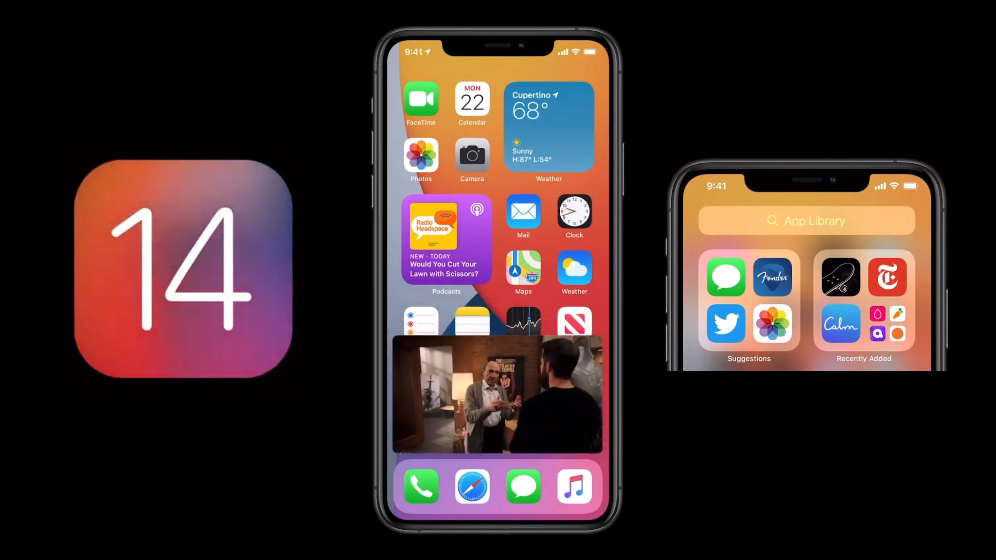
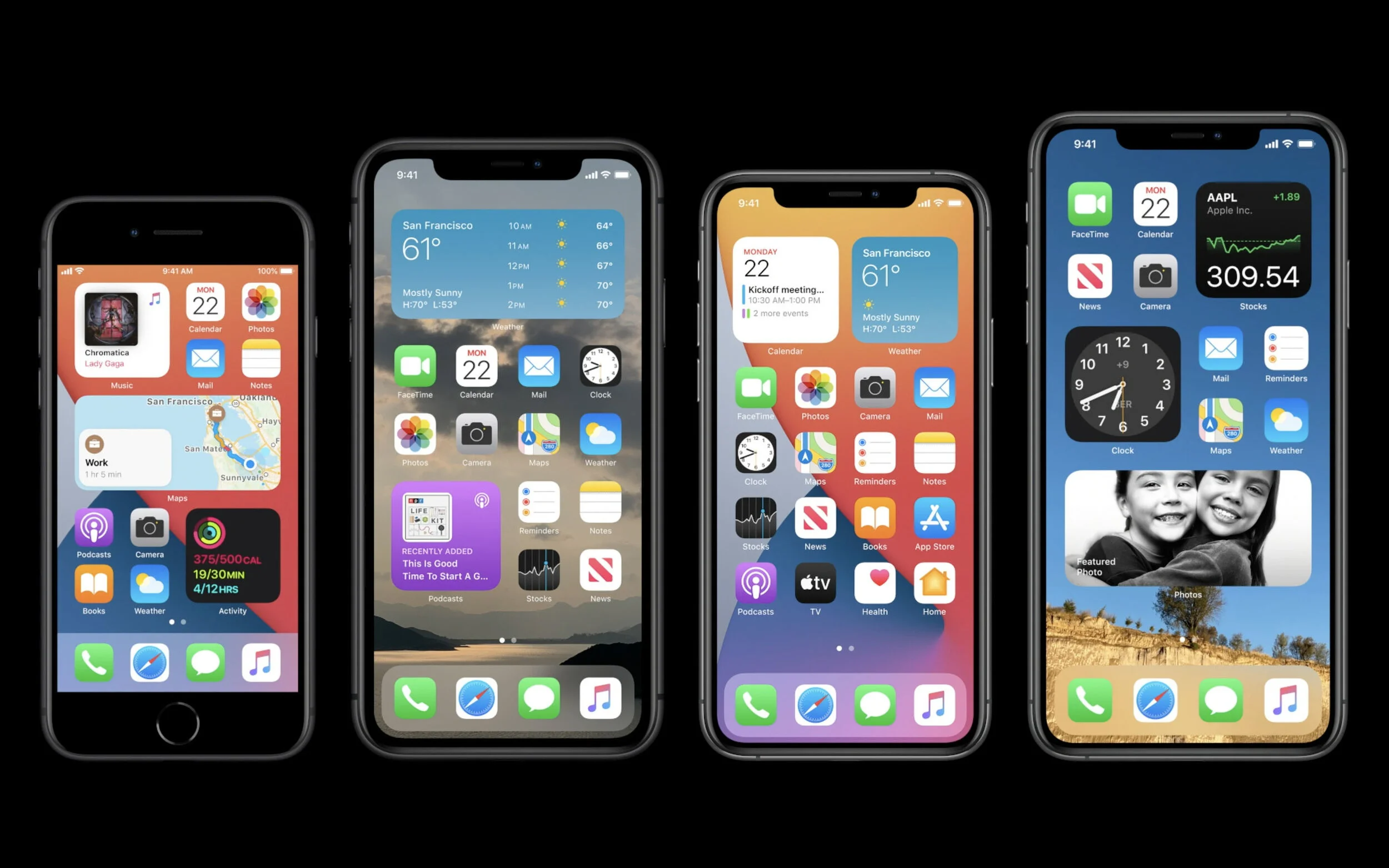
Even though widgets have been available on iOS for quite some time, the appearance is rather vanilla, with the vertical list of full-width boxes. With iOS 14, it appears Apple has done a complete widget overhaul. There are a bevy of information within the new widgets and a variety of sizes. You can now drag the widgets directly off the Today screen onto the home screen—the same gesture used in Android. One single "Smart Stack" widgets let any user swipe through any used widgets, and you can even set it to show widgets you mostly used for the day automatically.
It's safe to say widgets have finally matured in iOS 14.
2: Siri gets revamped
In the past, when you summoned Siri, it would take up an entire screen. Now In iOS 14, when you trigger Siri, it will show the Siri blob at the very bottom on display.
Siri can also translate written and spoken foreign languages in real-time. The translations are made possible by an Apple's Neural Engine. Here's something I think many iOS users will appreciate, Apple will now preserve your data without storing it on the companies server.
3: The Picture and picture is real
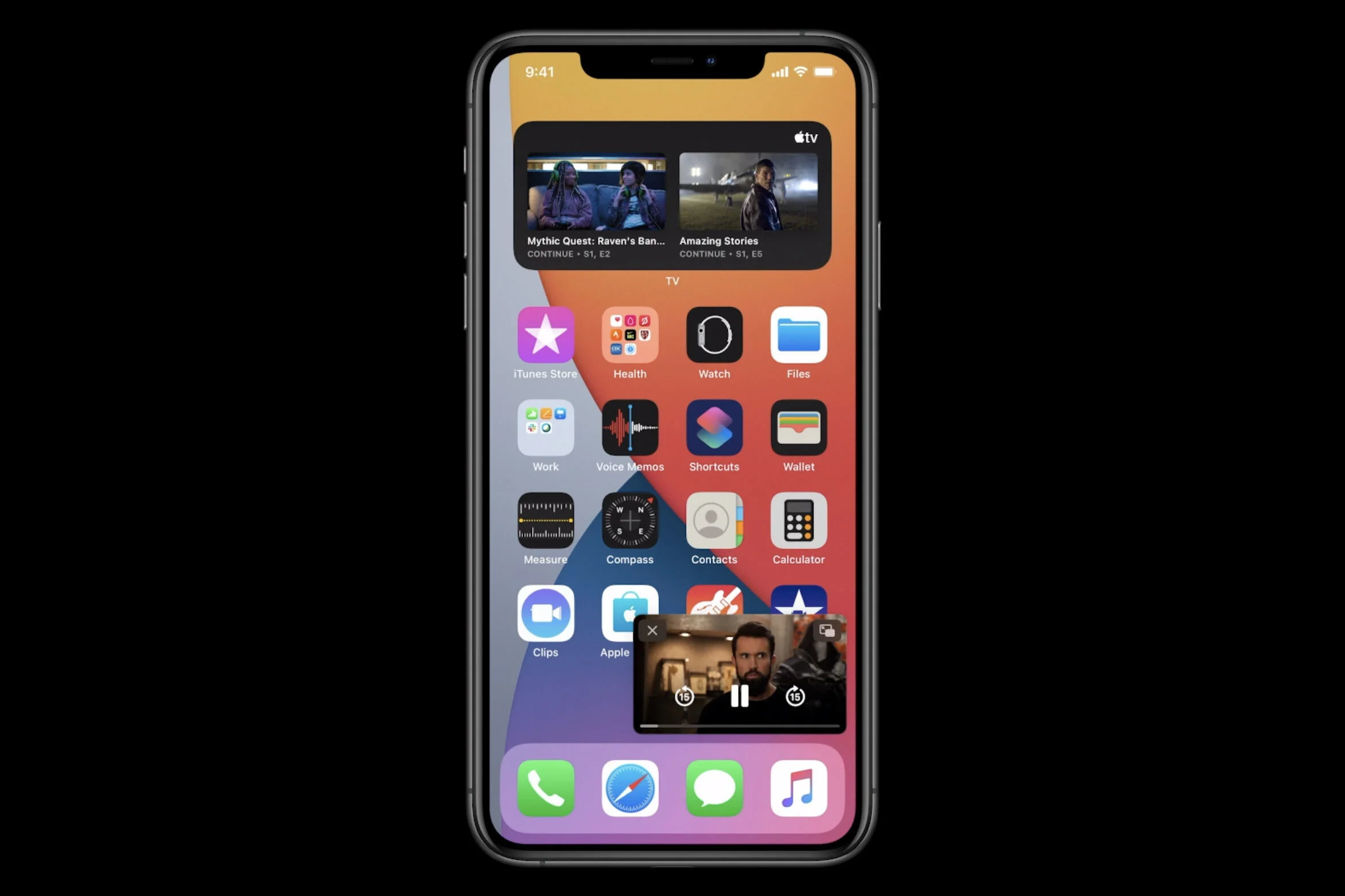
Another feature found on Android OS is picture and picture mode. Once only available on the iPad, this feature will now be present in iOS 14. While browsing on the web or FaceTime, users can now swipe back to the home screen, and video will continue to play in a shrunken box, allowing users to use the iPhone for other tasks.
You can even move the box around or swipe it off to become a little tab, with the audio still playing.
4: Incoming calls are now compact
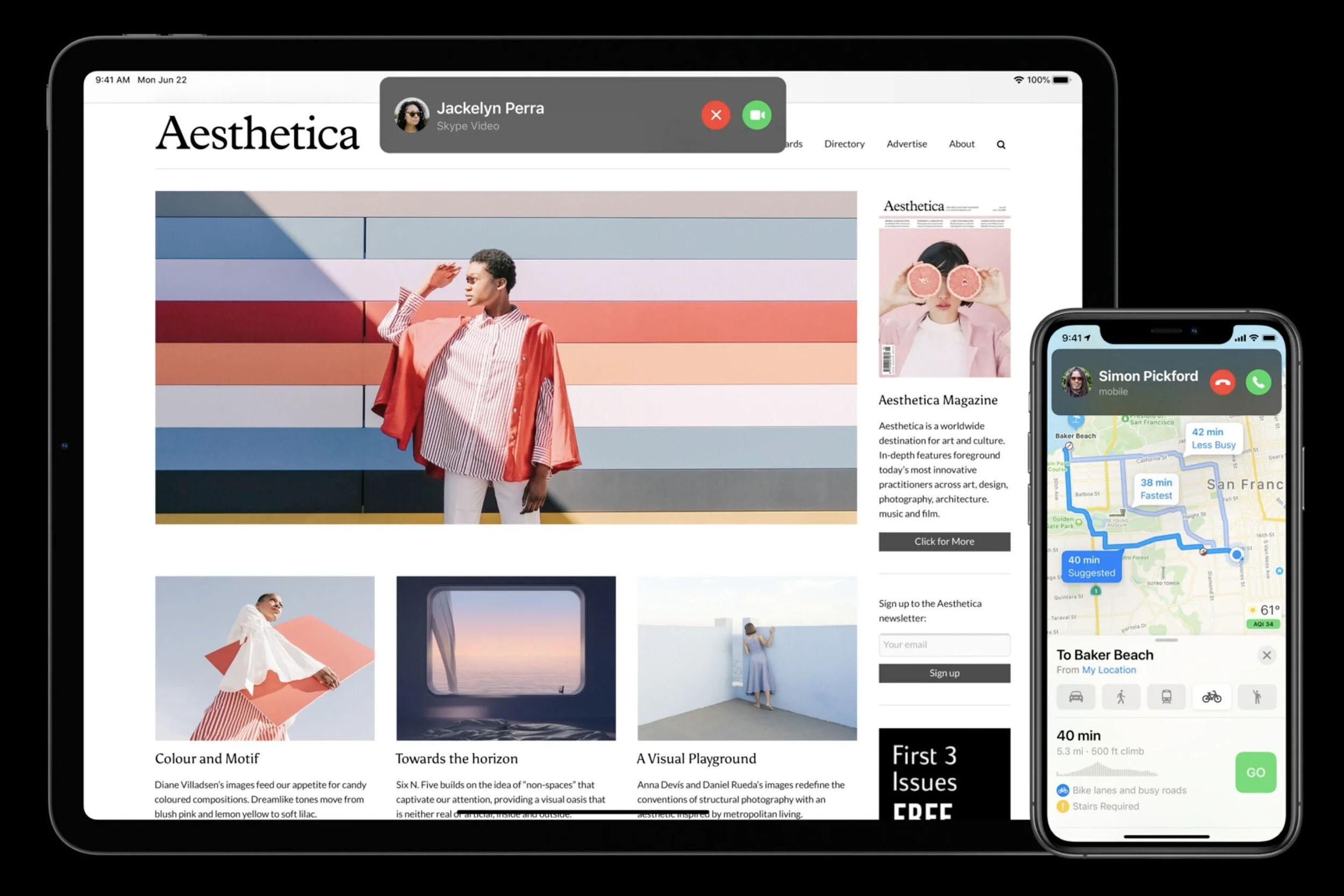
Another feature that usually takes up an entire display is incoming phone calls. Now it's collapsed into a small, very compact notification pop-up. The one element in iOS 14 I'm probably impressed the most. All incoming calls, whether FaceTime or Skype, will now show up as a small drop-down notification that users can swipe away or ignore.
5: The new and improved Messages
Since switching to Android, Messages is the one feature I missed the most, and now it's adding new features across iOS, iPad OS, and macOS.
Users can now pin up to nine conversations, keeping all your stack Messages at the very top. Perfect for anyone who likes to engage in different conversations. You can now see images of everyone who's in your group conversation, with the most recent individuals first, and can even give groups a name and it's very own image. You can reply to messages in-line, making it easy for you to know you're responding to what a specific person said four messages ago, instead of someone's most recent reply.
**Added Bonus: Home screen App Library
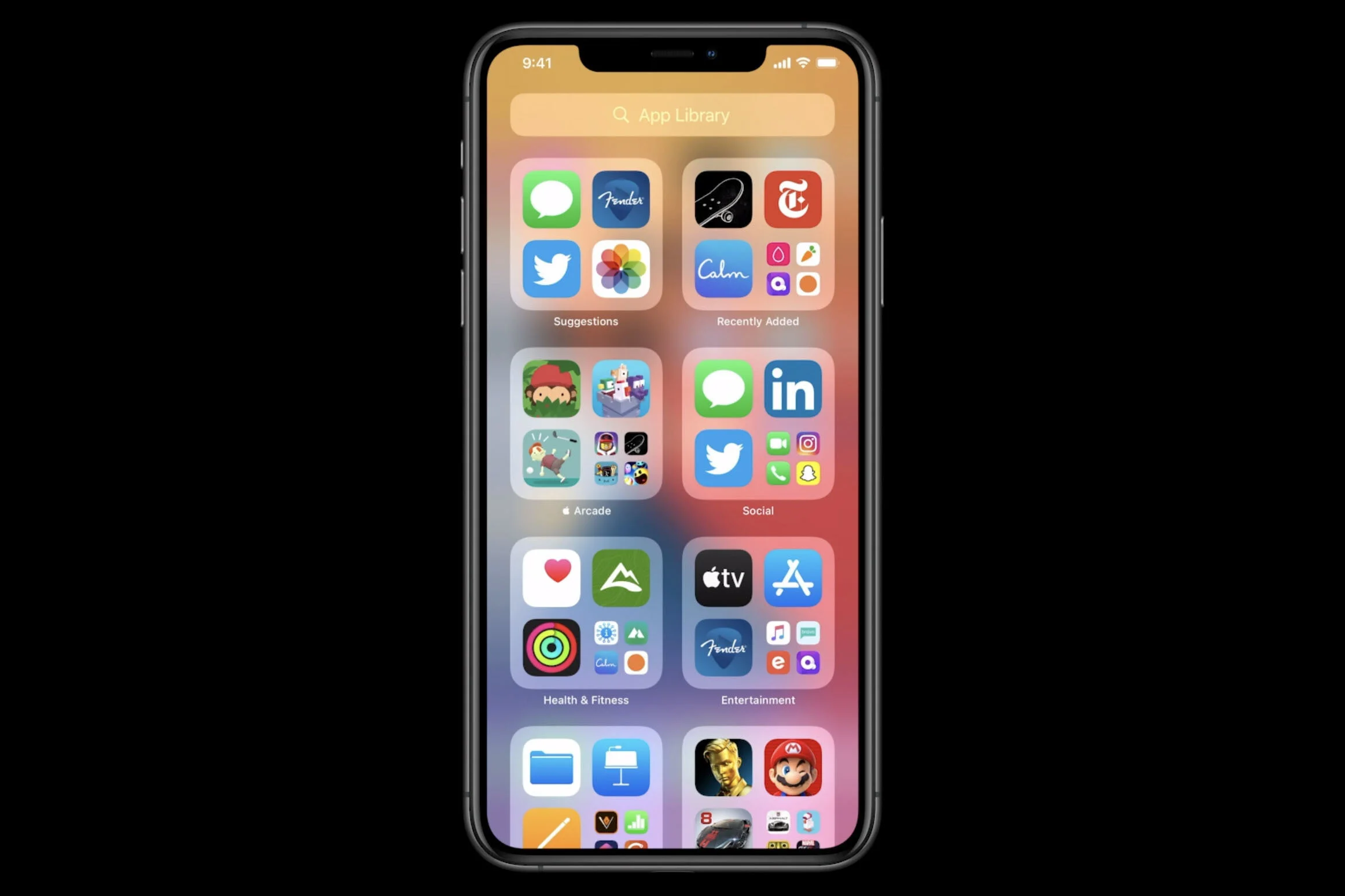
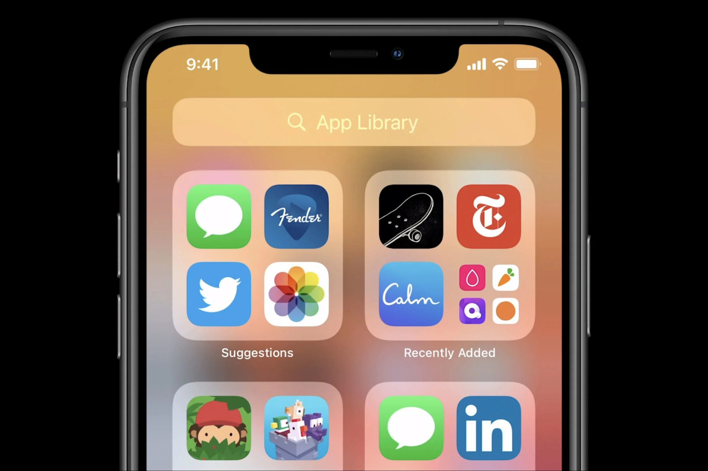
I was about to hit the published tab, totally forgetting to include this feature on the list. Nevertheless, Apple finally changes the entire iOS home screen. With iOS 14, users can now remove apps from the home screen, or eradicate all the apps from the screen altogether.
The App Library automatically groups all your apps into one big folder displaying the most recently used app within. You can search for apps using a search box at the top of the screen, see automated suggestions in the upper-left box, and recently used app in the upper-right box. Folders can also be categorized.


